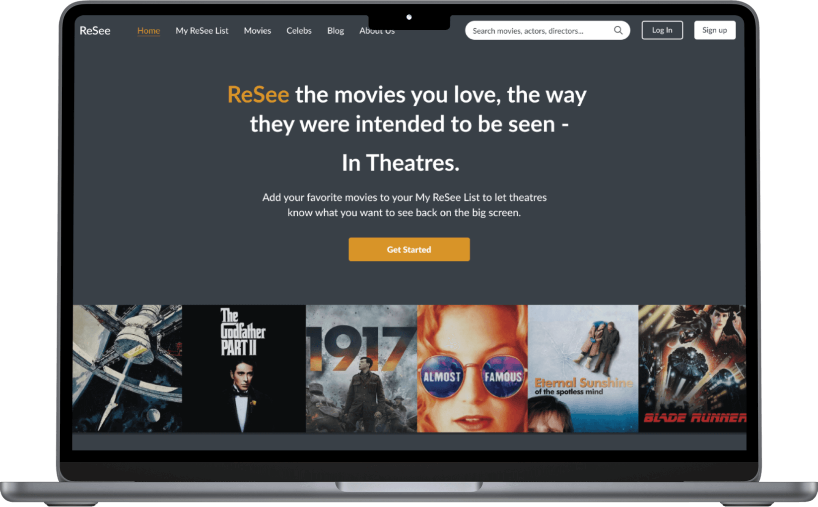
Resee Movies
Website Redesign
BACKGROUND
With the rise in popularity of home streaming services, movie theatres have seen a drop in movie-goers. ReSee is a web platform that wants to help draw crowds back to the big screen by allowing people to create movie wishlists and advocate for their favorite films to be rereleased in theatres to be reseen.
OBJECTIVE
I worked on this project with two other designers. ReSee Movies came to us during its early stages of development. To further determine their product strategy, they wanted to better understand their users and evaluate user interaction with the beta website.
ROLE
UX Researcher
UX Designer
TIMELINE
3 weeks
TOOLBOX
Figma, Miro
PROJECT TYPE
Client Project
PROCESS
Taking an informed approach
Our client had just finished developing a beta version of the ReSee website. They wanted to gather feedback on how to improve their beta website and user flows. They had only conducted minimal research on the website's usability and limited research into potential users.
Our team came up with two objectives as we went into the first phase of this project:

In order to make the best choices for the redesign, we needed more information to guide us. We chose to utilize design thinking in our approach. We decided to begin by evaluating the product as it was, collect a baseline, and move forward from there. We also prioritized speaking with potential users to better understand their needs, wants, and pain points in order to help ReSee better understand their users as it furthers its product strategy.
EMPATHIZE
Assessing the beta
We conducted moderated usability testing sessions to observe users interacting with the website interface. Criteria for participants included participants who considered themselves film enthusiasts and people who enjoyed going to the movie theatre. We completed task-based usability sessions with 8 participants. Each participant was asked to complete two tasks using the website. Following the test, we spoke with our users about their experiences.
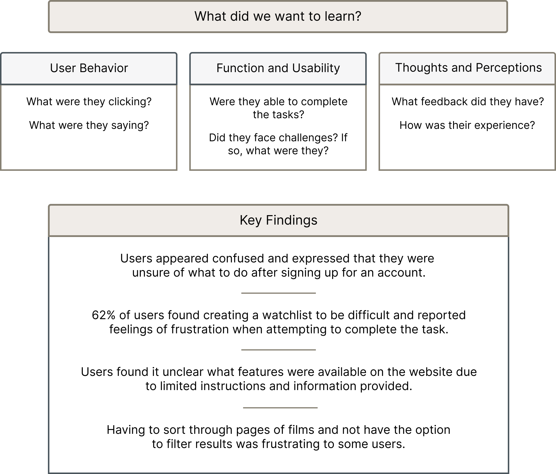

Speaking with moviegoers
We completed a total of 10 in-depth 1:1 interviews. We talked to people who viewed themselves as avid or average movie watchers and goers. Our goal was to learn and understand more about others's movie-watching experiences and identify any possible areas of opportunity for our redesign. We then sorted the responses onto an affinity diagram using Miro to identify any patterns and trends among participants’ needs, expectations, likes, and dislikes related to the movie-watching experience. Below are some of the questions we had and wanted to find answers to.

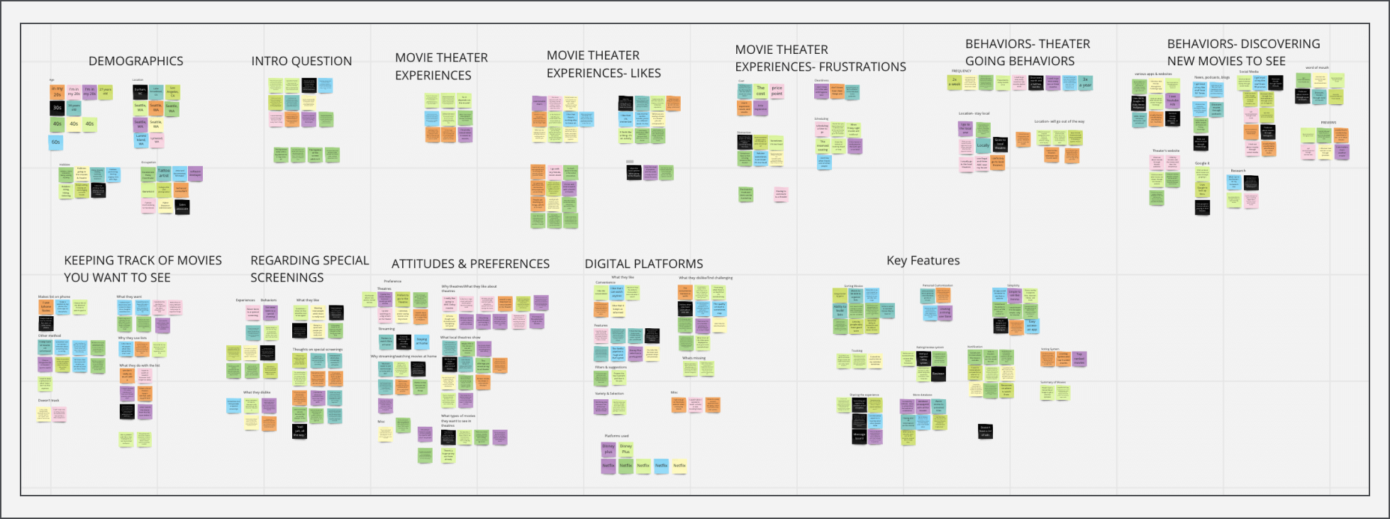
Affinity diagram of user responses
Talking to our audience taught us that people were

Looking to our competitors
Based on our usability and our interview findings, we took a look at how our direct and indirect competitors conveyed instructions during the onboarding process, how they prompted users to create favorites or lists, film description pages, and other features. We looked at the terminology used and how they guided users to complete tasks. We examined typical patterns and elements and identified design opportunities that would provide users with a familiar and intuitive experience. We also assessed ReSee's user flow and compared it to its competitors. We looked at what screens a user had to go through in order to create a watchlist and used this information to help us create a more user-friendly task flow.
Content Analysis
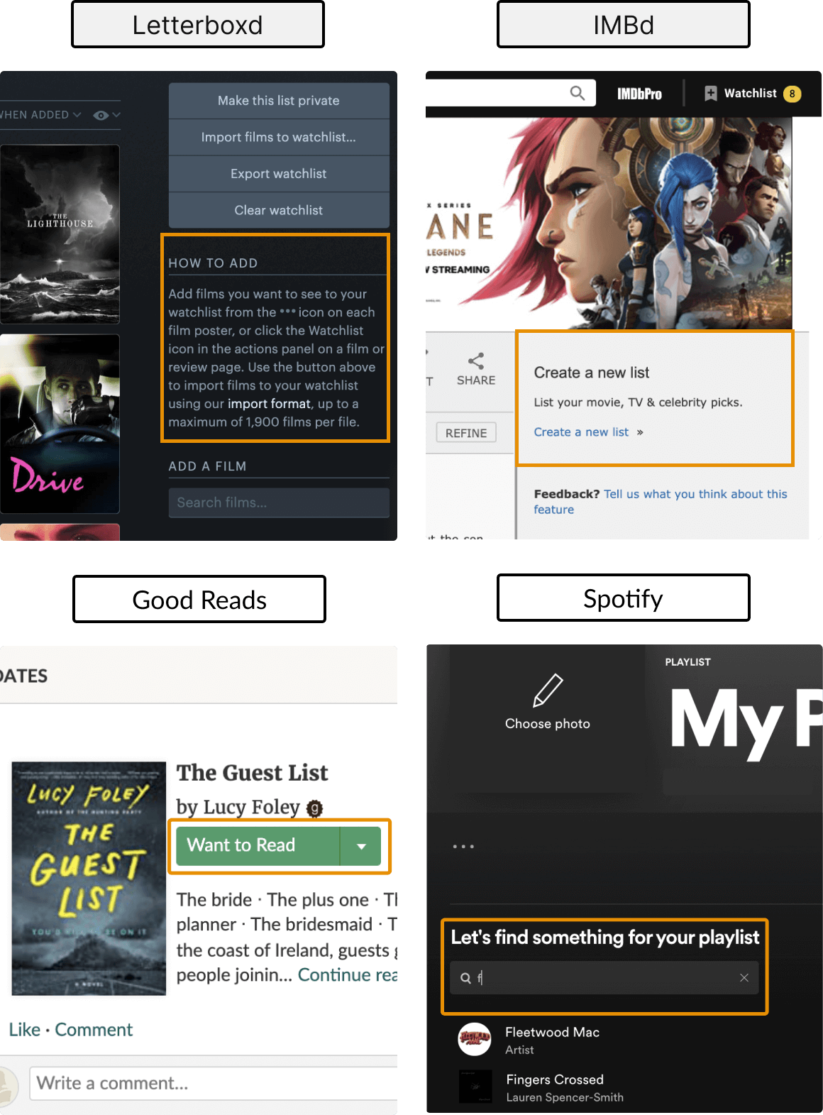
Example of an analysis we did on competitors' content delivery

Task Flow Analysis


DEFINE
Defining the problem
After conducting our research, we synthesized our findings to identify relevant insights that would help direct our decisions for the redesign. We were able to identify this key problem statement below:


IDEATE
Proposed solutions
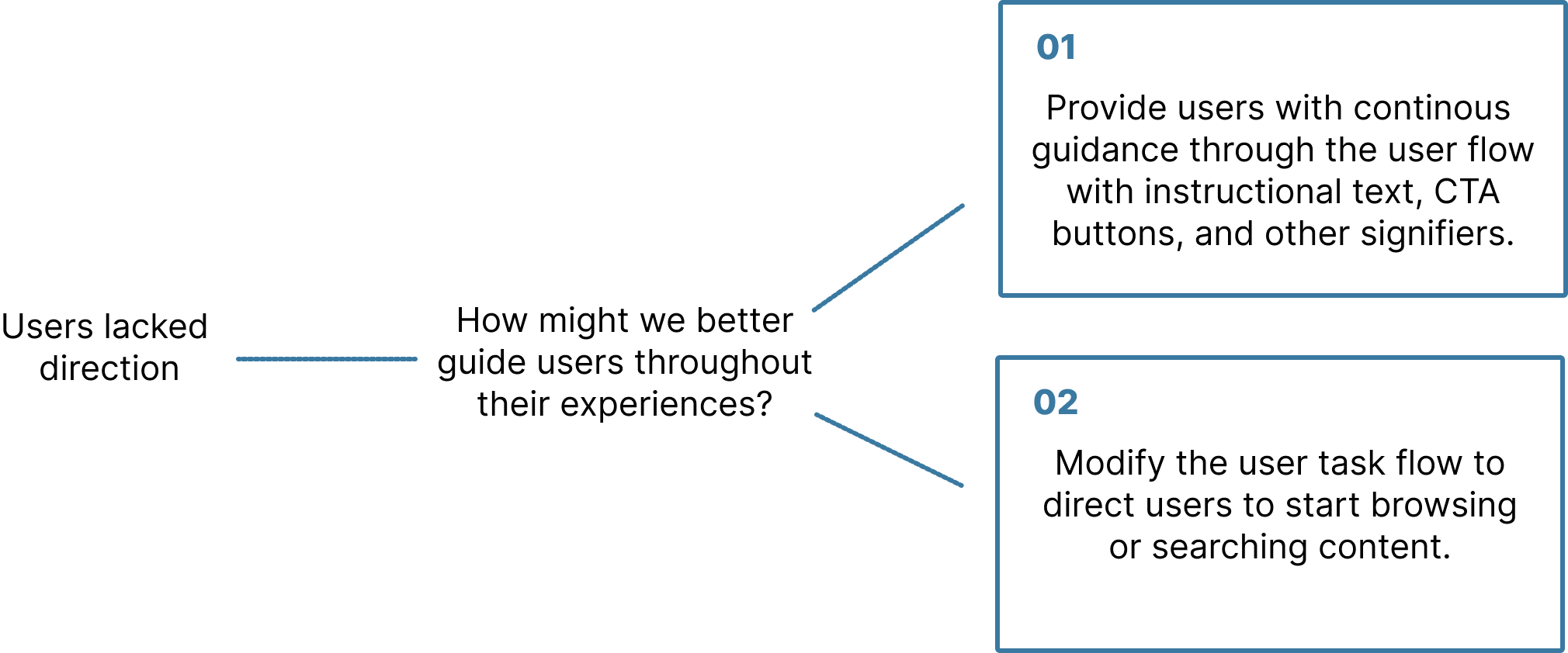
Based on our 1:1 interviews, we found that people value easy-to-learn and straightforward digital experiences. We then brainstormed solutions for improving ReSee's user experience based on what we knew. We thought about how we might improve communication to users about how to get started with creating a watchlist after signing up. Also, how we might optimize the user path to provide a more efficient experience. We identified the following solutions below:


PROTOTYPE
Providing users with continuous guidance
To better guide users through the onboarding process,we added step-by-step instructions on the home screen to preface users before getting started. We also added supportive text and visuals such as CTA buttons, add icons, film suggestions on carousels, and search bars to guide users through the task of creating a watchlist and to also prompt users to search for films and add them to their watchlist. We provided visual cues throughout the flow to continously guide users through the screens.
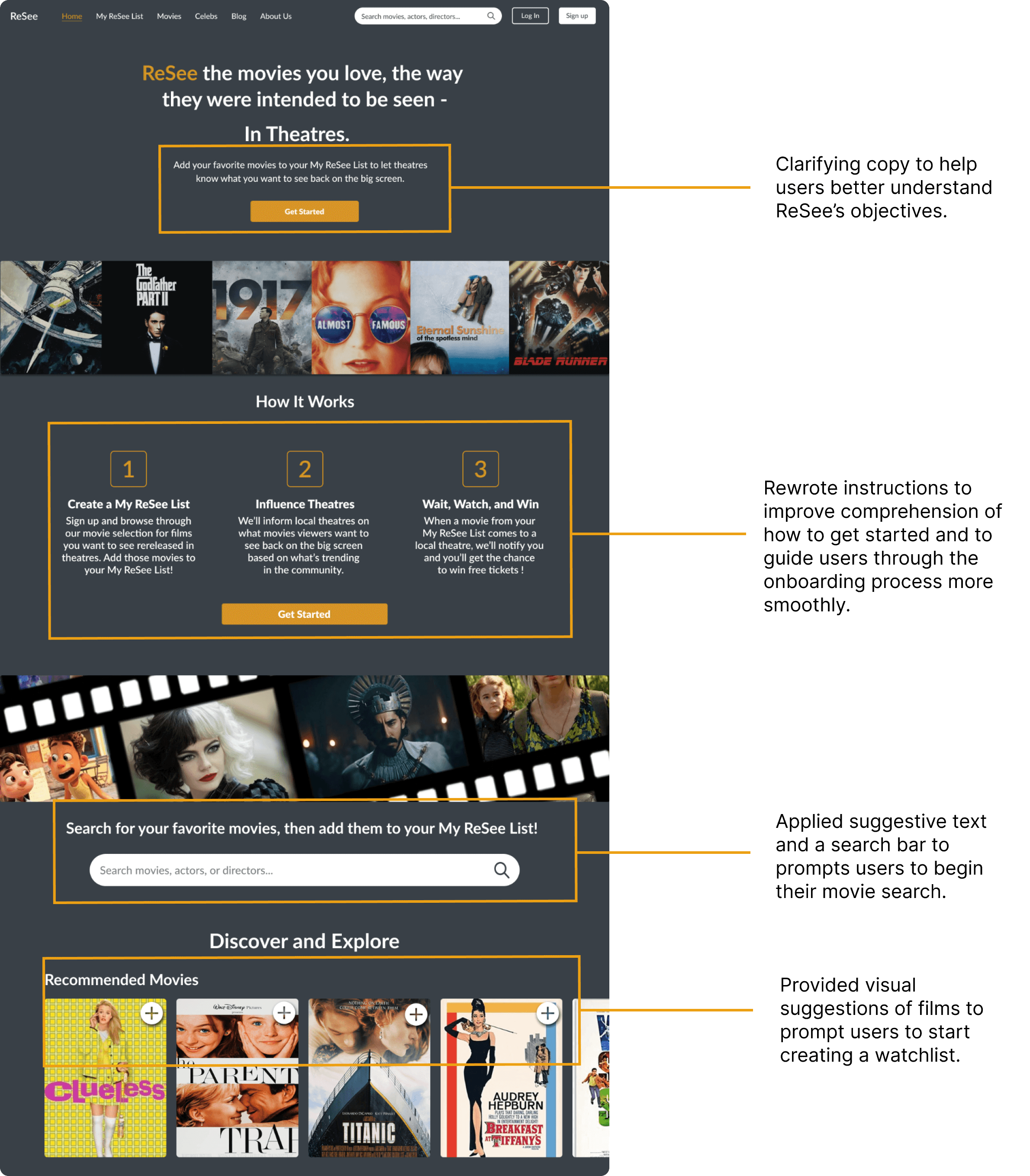
Redesigned home screen
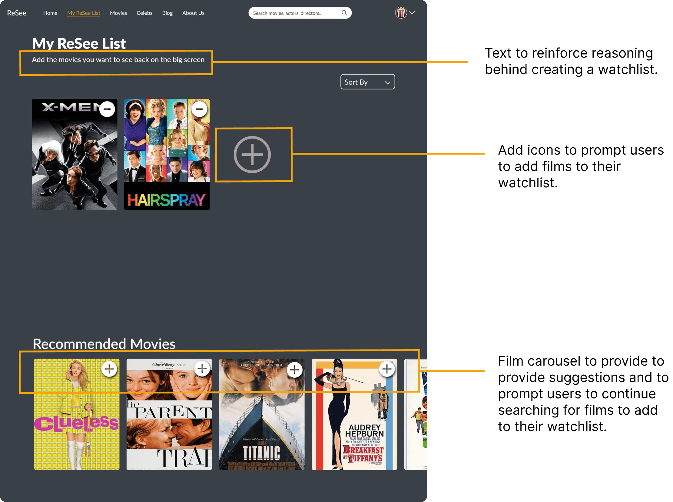
Redesigned watchlist screen
Modifying the onboarding task flow
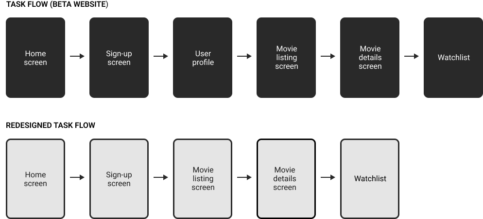
When users signed up on the beta website, they were taken to the user profile page, leading to confusion about how to proceed. We modified the task flow to bring users to the movie listings screen after signing up. The movie listings screen would provide users with instructions on how to create a watchlist and the option for users to start browsing and adding films to their watchlists.
Providing adequate instruction
Users were having difficulty understanding the concept behind creating a watchlist and reasoning behind features on the website. In order to help users have a more informed experience, we chose to increase instructional copy throughout the website.
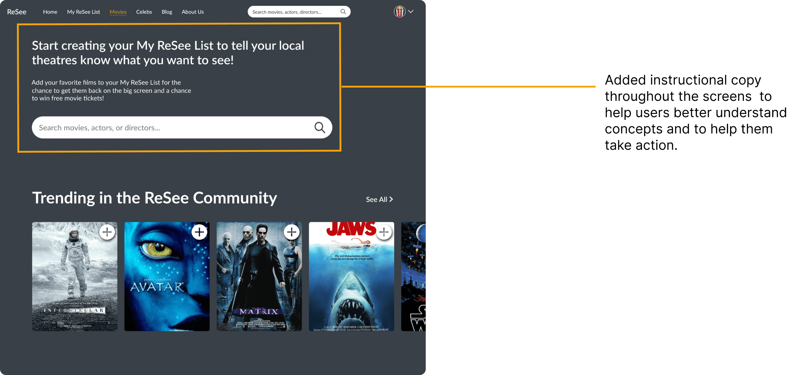
Redesigned Movie Listing Page
Helping users narrow down their results
Having to sort through pages of results to find a film or a particular actress or actor can take a lot of effort. To help users narrow down their search more efficiently, we decided to implement a filter and sorting system.
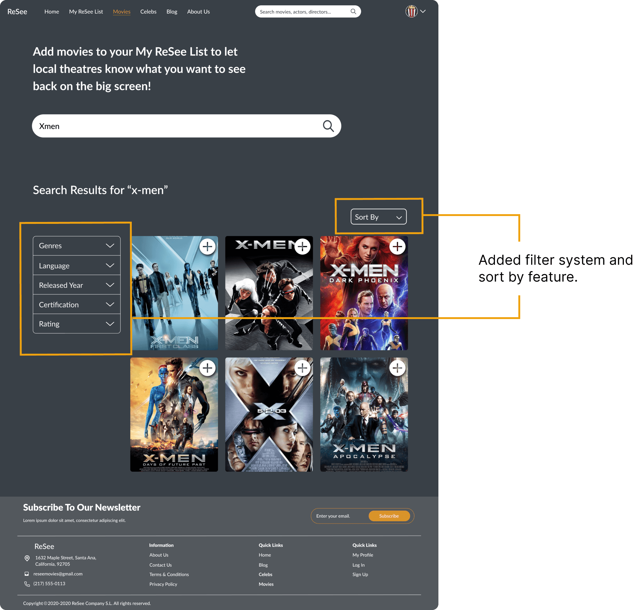
Redesigned search results page
TESTING
Usability testing with prototype
To observe users interacting with our design revisions and to assess our assumptions, we conducted usability testing with the prototype. Participants included individuals who considered themselves average or avid moviegoers. We asked participants to complete 2 tasks including signing up for an account and creating a watchlist. After completing the tasks, we asked users about their onboarding experiences and about the process of creating a watchlist. These were the main takeaways:

OUTCOME
Solutions and outcomes
We were able to identify areas of improvement based on the data and findings from the user research. To improve the onboarding experience for users, we modified the task flow during the sign-up phase, redesigned content to enhance communication with users, and added features to improve the search process.
With the redesigned prototype, users demonstrated low error rates and found tasks easier to complete when signing up for an account and creating a watchlist compared to users who attempted to the same tasks with the beta website.
Recommended next steps
Based on all the findings from the initial research and information from the second round of usability sessions with the redesigned prototype, we provided the following recommendations as ReSee continues developing its product.

Lessons learned
One of the lessons I learned during this process was the importance of planning for testing early in the process. I found that planning allows for more time to go into recruiting the right participants, possibly recruiting backup participants in case participants are unable to attend, and non-rushed usability session.
Another insight gathered from this project was the importance of choosing metrics and utilizing those measurements throughout the testing process. Our team did not implement the same measure when testing the redesigned prototype. If we had, I believe it would have provided more support when advocating for our design decisions.
Lastly, I learned that continuous testing is valuable throughout the design process. Looking back, it may have been better to continuously test the copy to see what works best with users rather than wait to assess it with the high-fidelity mockups. I believe, in the long run, early testing can help gather feedback that can help validate assumptions prior to having to make bigger changes to a finished mockup.