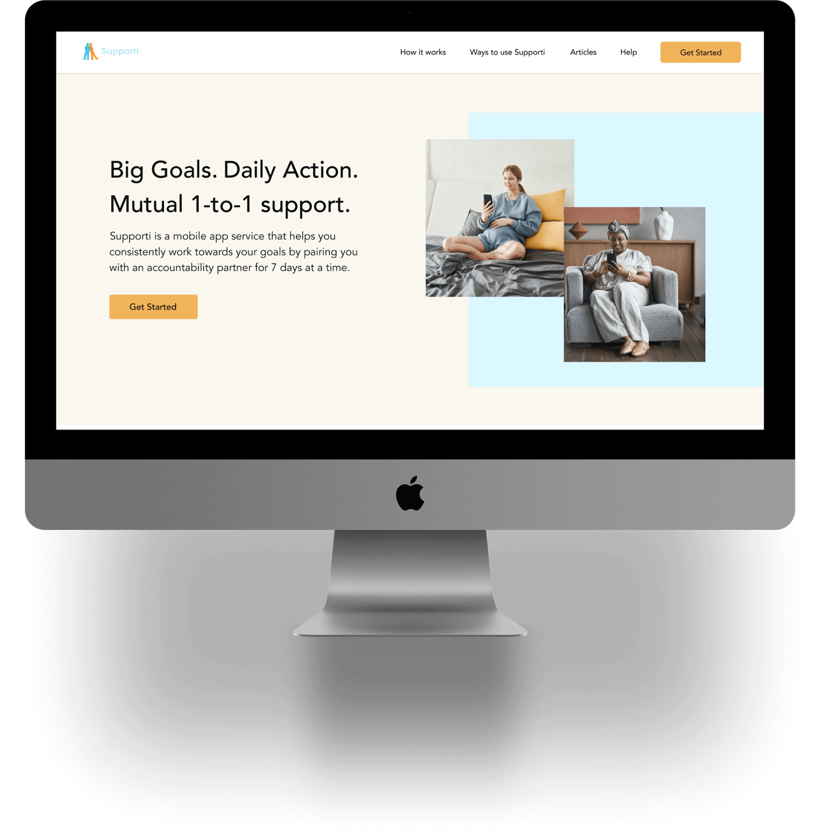
Supporti
Homepage Redesign
Overview
Role: UX Researcher and Designer. Cross-collaborated on team with 3 other researcher/designers.
Duration: March - June 2022 (3 months)
Key Methods: Heuristic Evaluation, Competitive Analysis, Usability Testing, Wireframing
Tools Used: Figma, FigJam, Zoom, Otter.ai, Zeplin
Context
Supporti is a mobile app that aims to help people meet their goals, whether big or small. They connect users one-on-one for weekly partnerships where they provide each other with mutual support to meet their goals. Thousands of successful accountability matches had been made through Supporti, helping people stay on track with their intended goals. However, there had been increased amount of user feedback regarding unresponsive partners and confusions around abilities to modify goals and daily actions.
Problem Space
Partnership expectations and goal setting capabilities were not well understood by users. Our client wanted to identify solutions to address these pain points. We aimed to improve user understanding of partnerships and goal setting, to ultimately reduce customer support requests and increase subscription retention.
Solution
We were able to further explore and understand the pain points users encountered when using the website and mobile application through our research. Following the findings and parameters of the project, our team identified solutions to improve user understanding of goal setting abilities and partnership expectations.
Outcome
1. Identified actionable design solutions to improve user understanding of partnerships and goal setting.
2. Revised copy and redesigned homepage interface and provided implemented design changes in wireframes.
3. Validated design choices and demonstrated an increase in user comprehension of Supporti's services.
Research Process
Feedback from users showed that they were confused about what was expected when establishing goals and partnerships with other users. To make Supporti's service effective, users must commit to their goals and their responsibilities as accountability partners. This is why it's so important that they understand partner needs and how to set their goals. Research was the first step in our approach. The goal was to:
1. Further evaluate the product space, user needs, and pain points.
2. Identify design solutions that would address user needs and pain points.

Content Analysis and a Heuristic Review
To gain a better understanding of the product space and what users were experiencing, we conducted a heuristic review and analyzed content within the website and mobile app. We analyzed how Supporti compared to typical design and usability patterns.

Sample of our analysis of one of the website screens.

Examining Customer Support Feedback
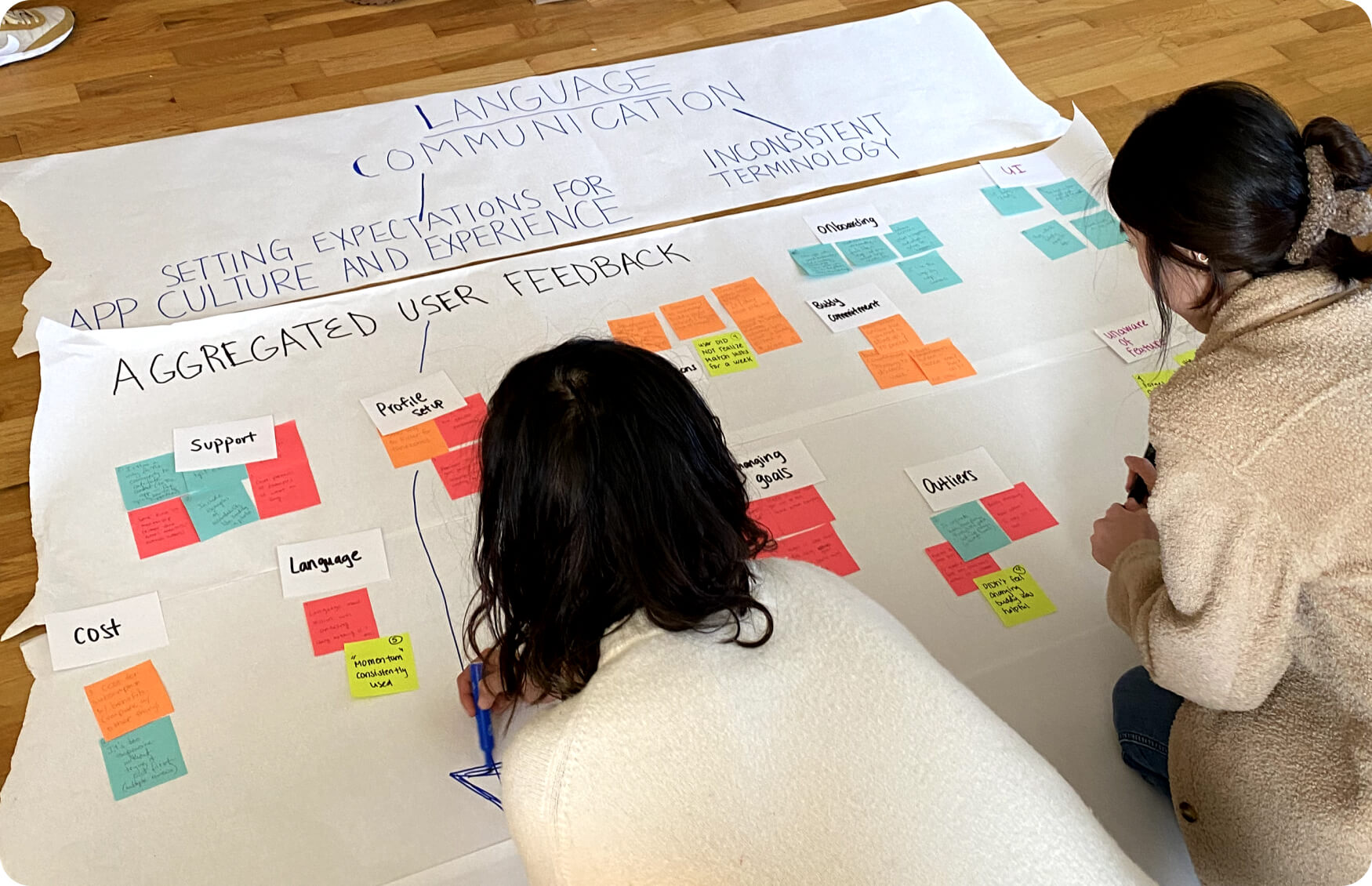
We then further explored the information we already had. We gathered qualitiative feedback from customer support emails to better understand the issues users were coming across. We noted quotes onto post-its and organized them into categories to identify patterns. We put them into categories and identified common themes.

Competitive and Comparative Analyses
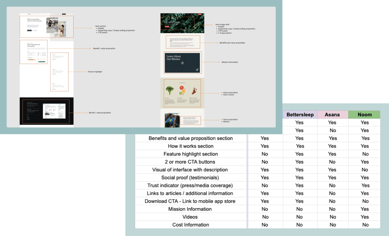
We looked to direct and indirect competitiors to assess current trends and patterns to better understand what users might find familiar and expect when it comes to learning information about features and expectations for services similar to Supporti. Since we were focusing on redesigning the homepage at this stage, I conducted a feature inventory to assess common content among app services similar to Supporti.
Usability Testing
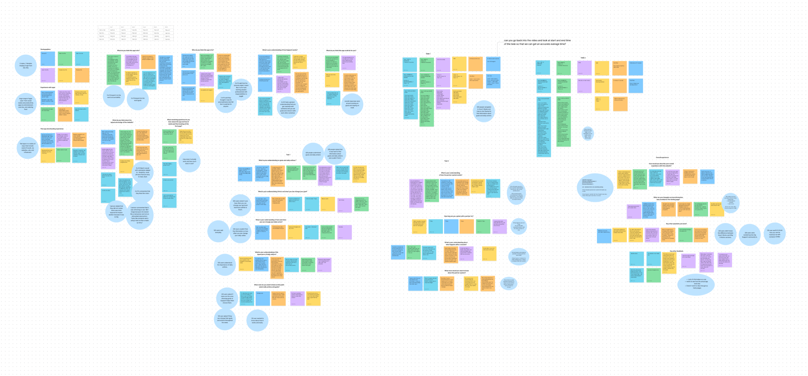
Though we had an idea of what issues users were coming across, we didn't have a complete picture of what was confusing for users on the homepage and website. We wanted to know what content was unclear or missing and how users could better understand information about goal setting and partnerships. To further evaluate this, we conducted usability testing to better understand user comprehension of Supporti based on the design, structure, labeling, and flow.
- Task involved participants visiting the website homepage and answering a set of questions afterwards.
- Conducted remotely over Zoom
- 6 participants
- 45-60 minutes

Research Summary
Defining the problem
We concluded that due to lack of visibility and difficulty finding information about features such as goal setting, users were not able to optimally learn about these topics. This resulted in user frustration and confusion due to differing expectations when using the Supporti app.
Determining Solutions
We wanted to inform users, reinforce partnership expectations, and increase their understanding of goal setting abilities. We considered ways to make finding and consuming this essential information easier. Following a brainstorming session, we came up with the following solutions:
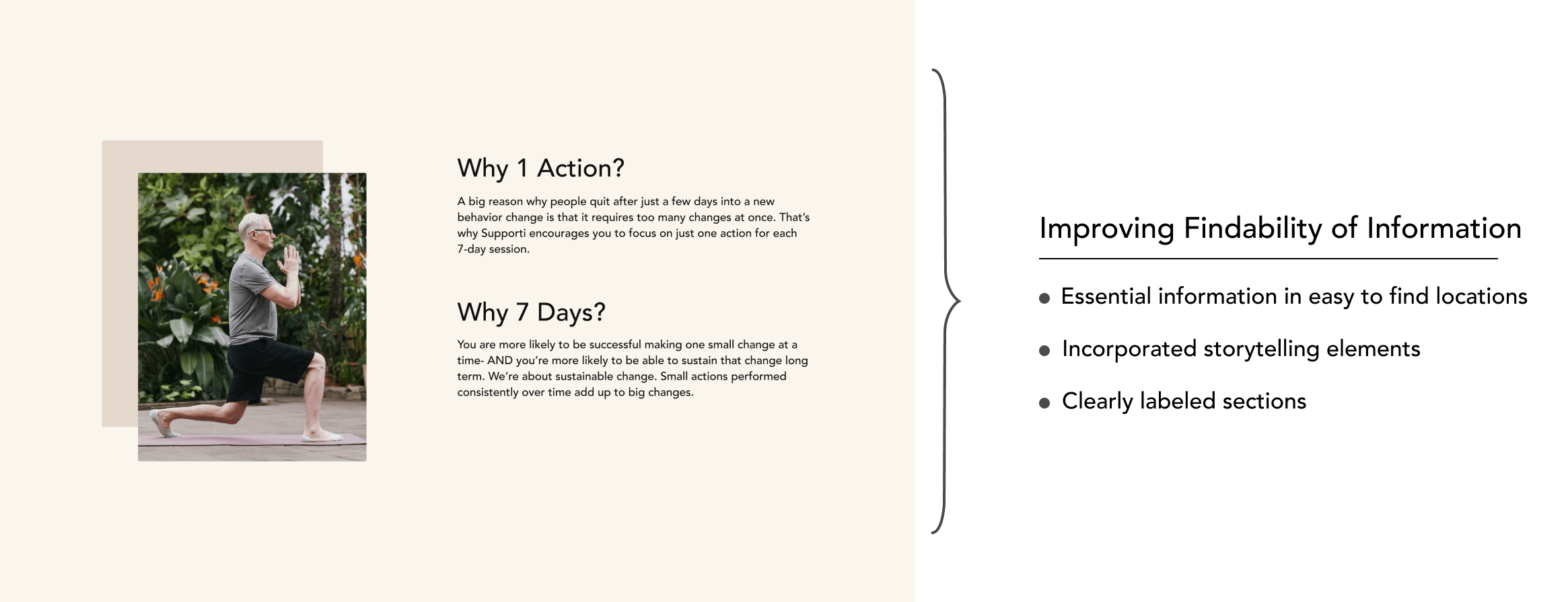
IMPROVE THE VISIBILITY OF INFORMATION
Users should be able to find information easily and be well informed when setting their goals. Essential information should be clearly visible and easy to scan. Therefore, in the redesign we suggested incorporating these elements:
- Essential information in easy to find locations
- Clearly labeled sections
- Storytelling structure and flow
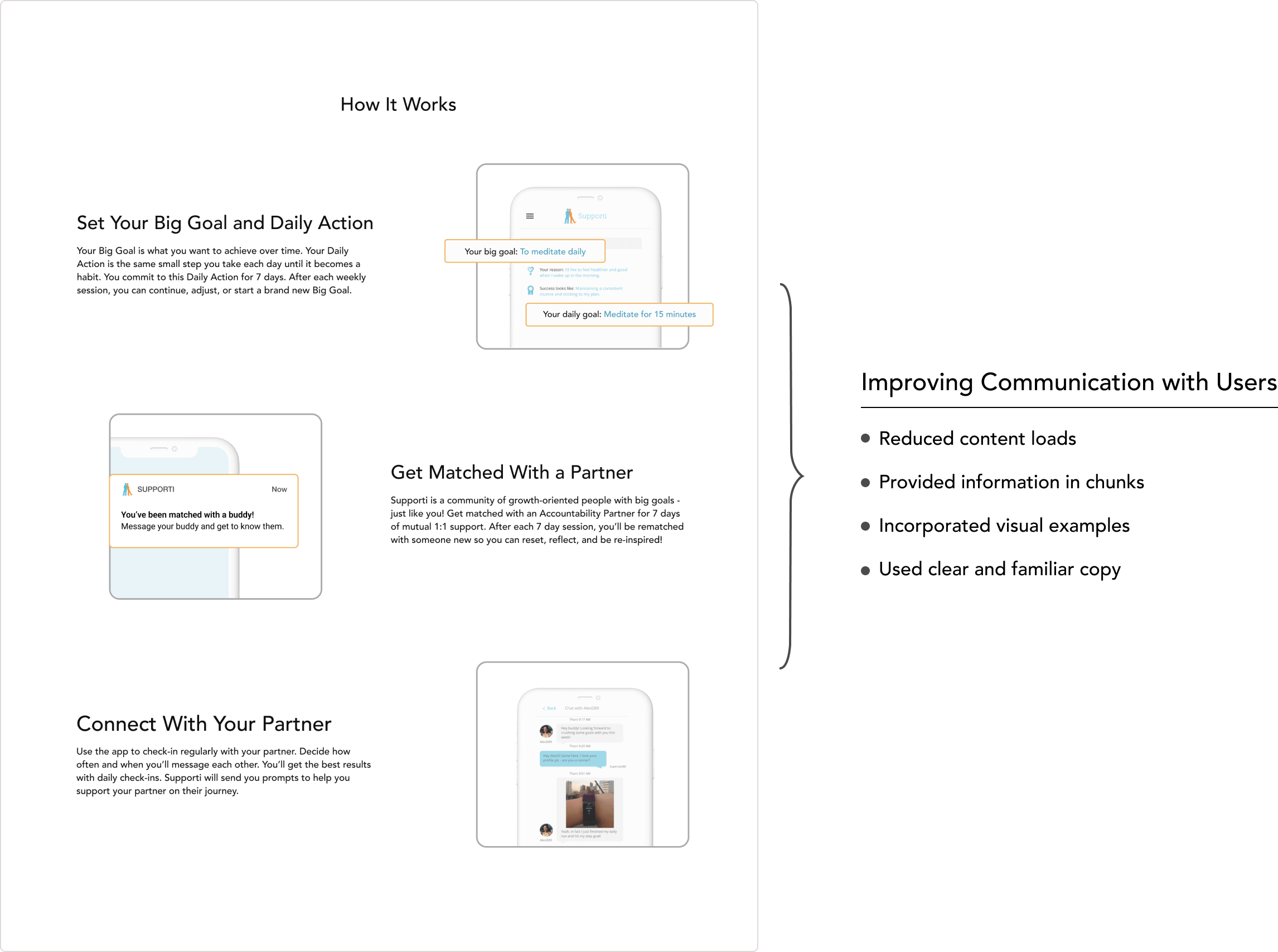
IMPROVE COMMUNICATION TO USERS
When information is broken down into smaller pieces, people are more likely to learn it. Familiar terminology and imagery may also improve how people process information. We suggested incorporating these elements:
- Reducing content loads
- Displaying information in chunks
- Providing visual examples and modeling
- Utilizing clear and familiar copy
Ideation and Application
Ideating and Sketching
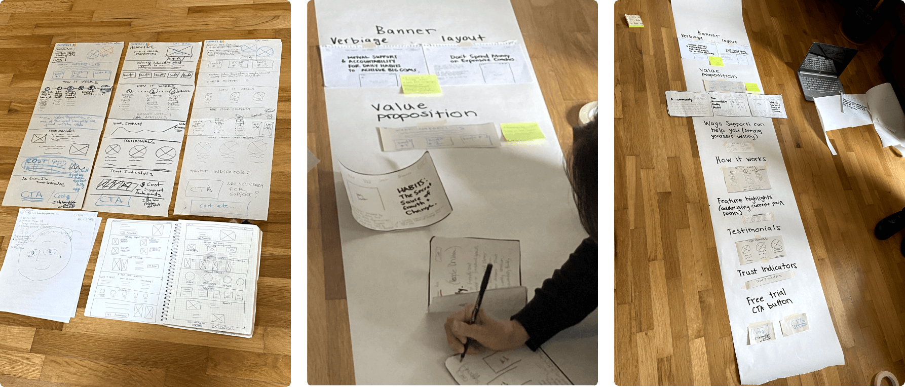
Due to project parameters, our focus at this time aimed at applying our solutions to the website homepage. We sketched our ideas and determined what features we wanted to include on the new homepage. We revised the copy around partnerships, goal modification, and partner matching with the goal of enhancing user understanding of these topics. We each created different versions of low-fidelity wireframes and collaborated to combine our versions into one layout.
Wireframing and Prototyping
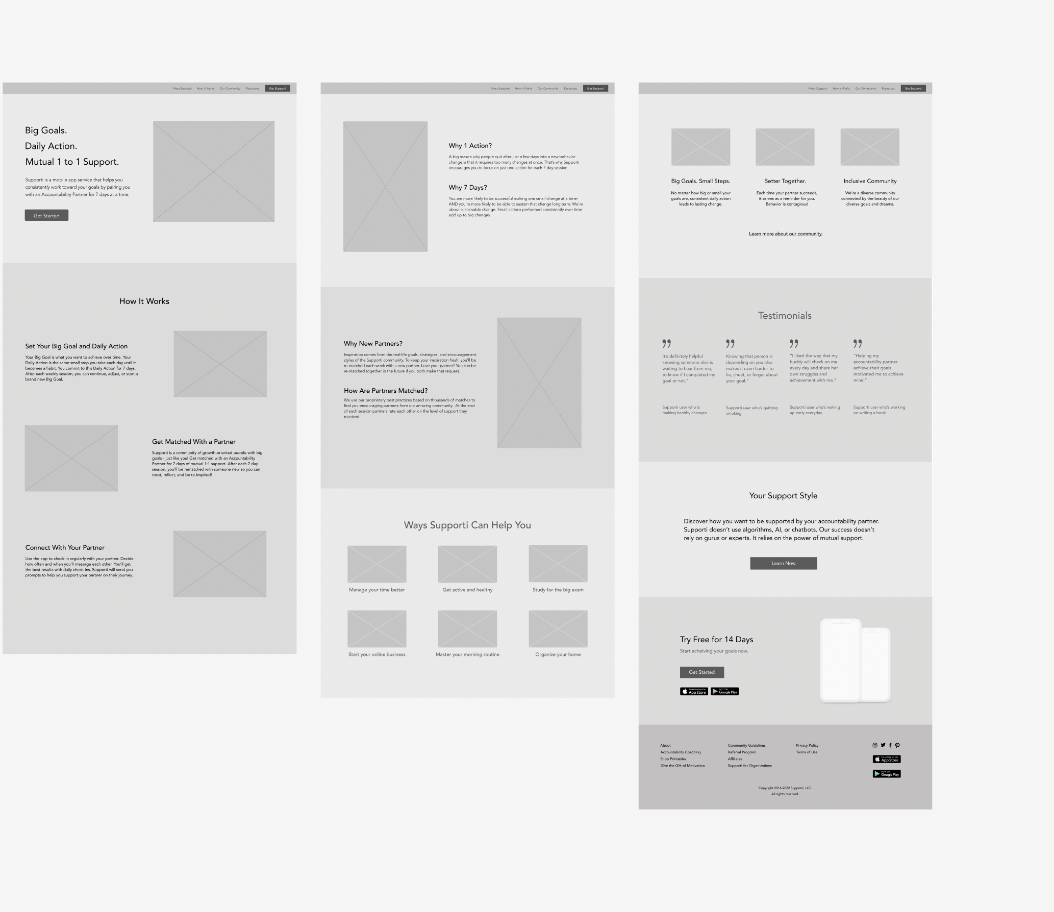
Once we came to a shared idea on the layout, we developed mid-fidelity wireframes. We create multiple variations, analyzing and revising content, and one round of testing and iterations before designing the homepage prototype.
Assessing Our Design Choices
We conducted usability testing to assess our design choices. Would our redesign help users understand information more clearly? Would users better understand expectations around partnerships and when they would be able to modify their goals and daily actions? Our goal was to determine if users could draw the correct conclusions about Supporti's services based on the design and information provided to them on the website homepage. Below are elements of the usability testing and the key findings.
- 6 participants, non-users
- Conducted remotely over Zoom
- 45-60 minutes
- Task involved users visiting the homepage prototype and answering a set of questions afterwards

Solutions Applied
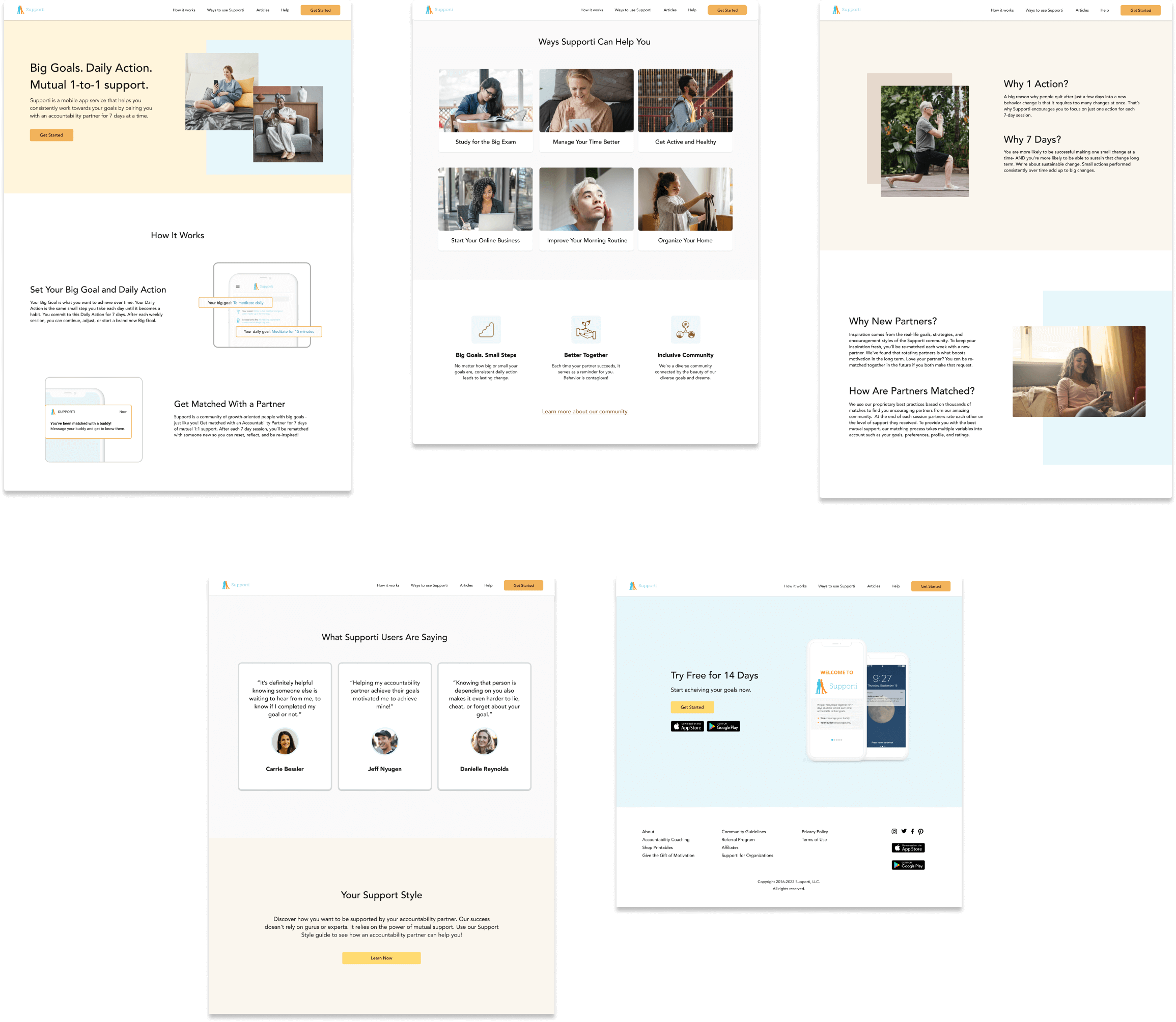
Impact
Through the research we conducted and the design recommendations we applied, we found that there was an improvement in how users understood if and when they were able to modify their daily actions and goals when using Supporti. We also found that, participants who interacted with the redesigned homepage reported more favorable experiences, reporting that they found the homepage informative and information easy to find, which constrasts the responses we received from participants who interacted with original homepage.
Reflection
This was a great experience that gave me further insight into the research planning and design process. I gained an understanding of the importance of clearly defining your objectives and questions at the start, and to remain organized in order to stay on track with your goals, especially when you are working with a large amount of data. I also gained valuable experience working on a team, and learned different strategies to collaborate effectively remotely.
© 2023 Jessica Rodriguez. All rights reserved.