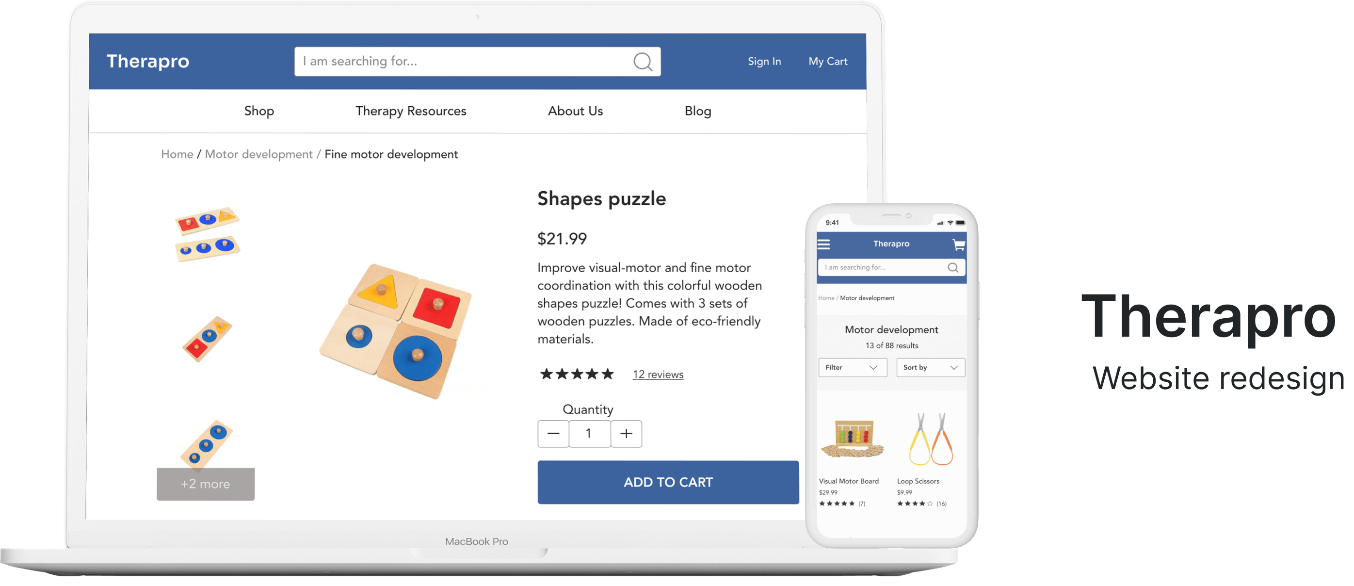
BACKGROUND
Therapro is a pediatric therapy e-commerce website aiming to provide rehabilitative specialists and teachers with high-quality therapy supplies and educational resources. They offer an extensive range of products that promote skill and motor development for the pediatric population.
OBJECTIVE
For this project, I was the sole researcher and designer. The goal of this project was to improve Therapro's e-commerce shopping experience for customers by optimizing the web user experience based on user needs.
ROLE
UX Researcher and Designer
TIMELINE
4 weeks
TOOLBOX
Figma, Whimsical, Trello, Zeplin
PROJECT TYPE
Conceptual
PROCESS
Laying out a plan
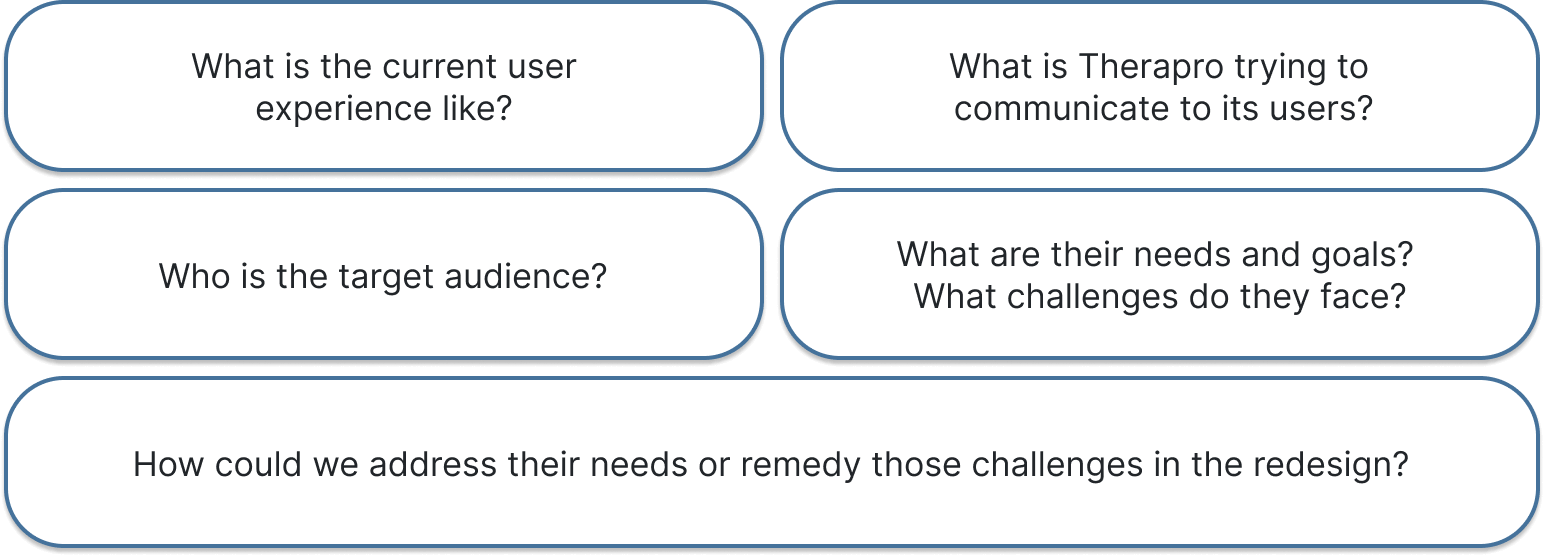
Starting out, I considered what I needed to know in order to make the right design decisions. To find this information, better understand the users, and inform the direction of the design, I chose to conduct primary and secondary research. Below are some of the questions that I wanted to answer.
Understanding the product
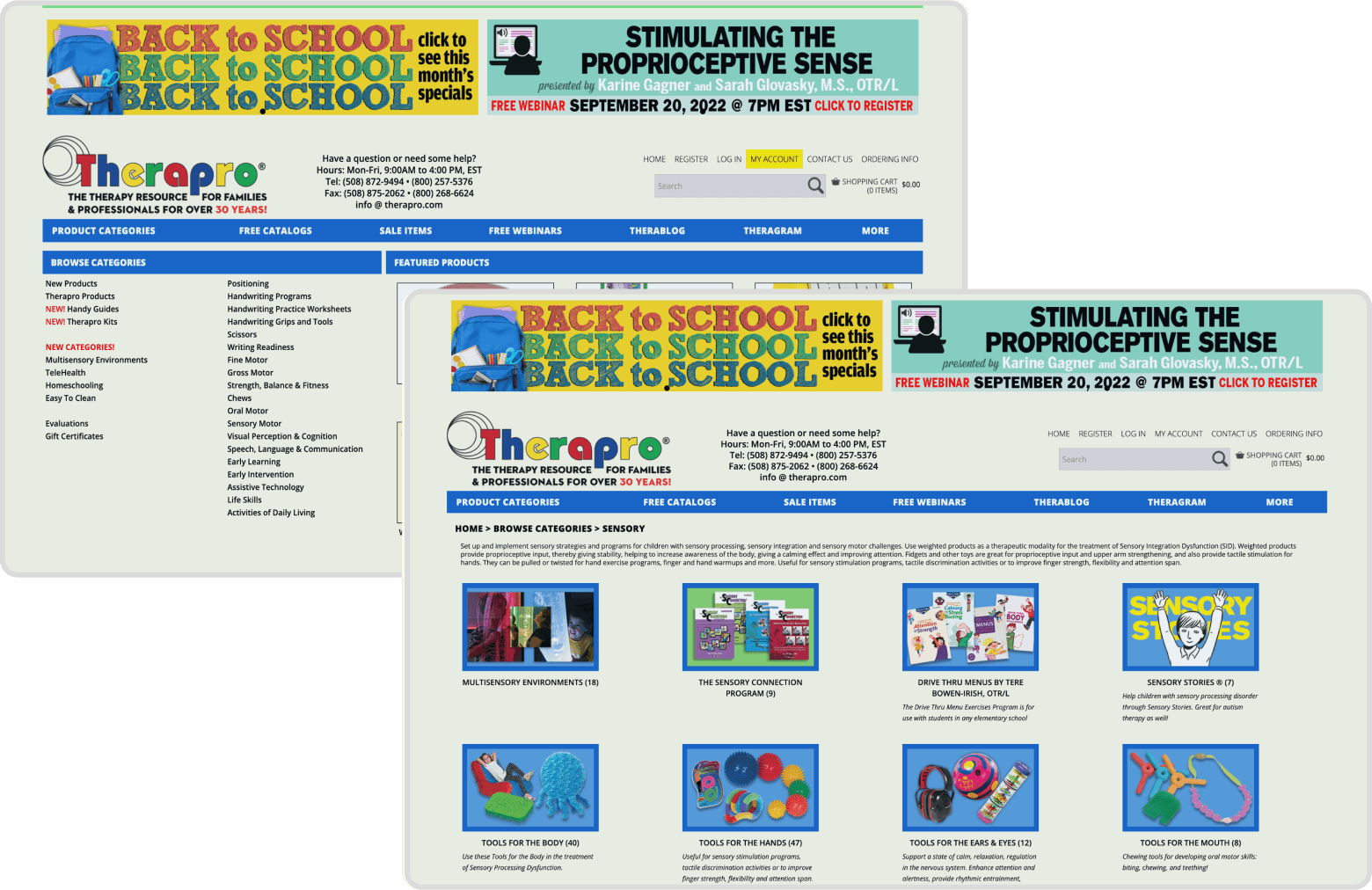
To better understand the problem space, I further researched Therapro's products and identified potential users. Their target audience included teachers, parents of children, and speech, occupational, and physical therapists. In addition, I conducted a heuristic review to evaluate how well the digital user experience met common usability standards. Based on the analysis, I found areas for improvement mainly related to visibility, consistency, efficiency, and aesthetics.
Gathering insights from our audience

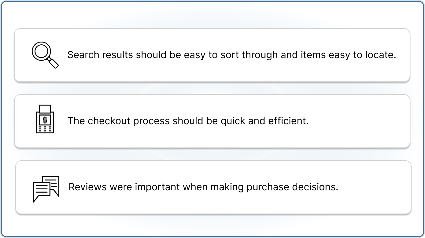
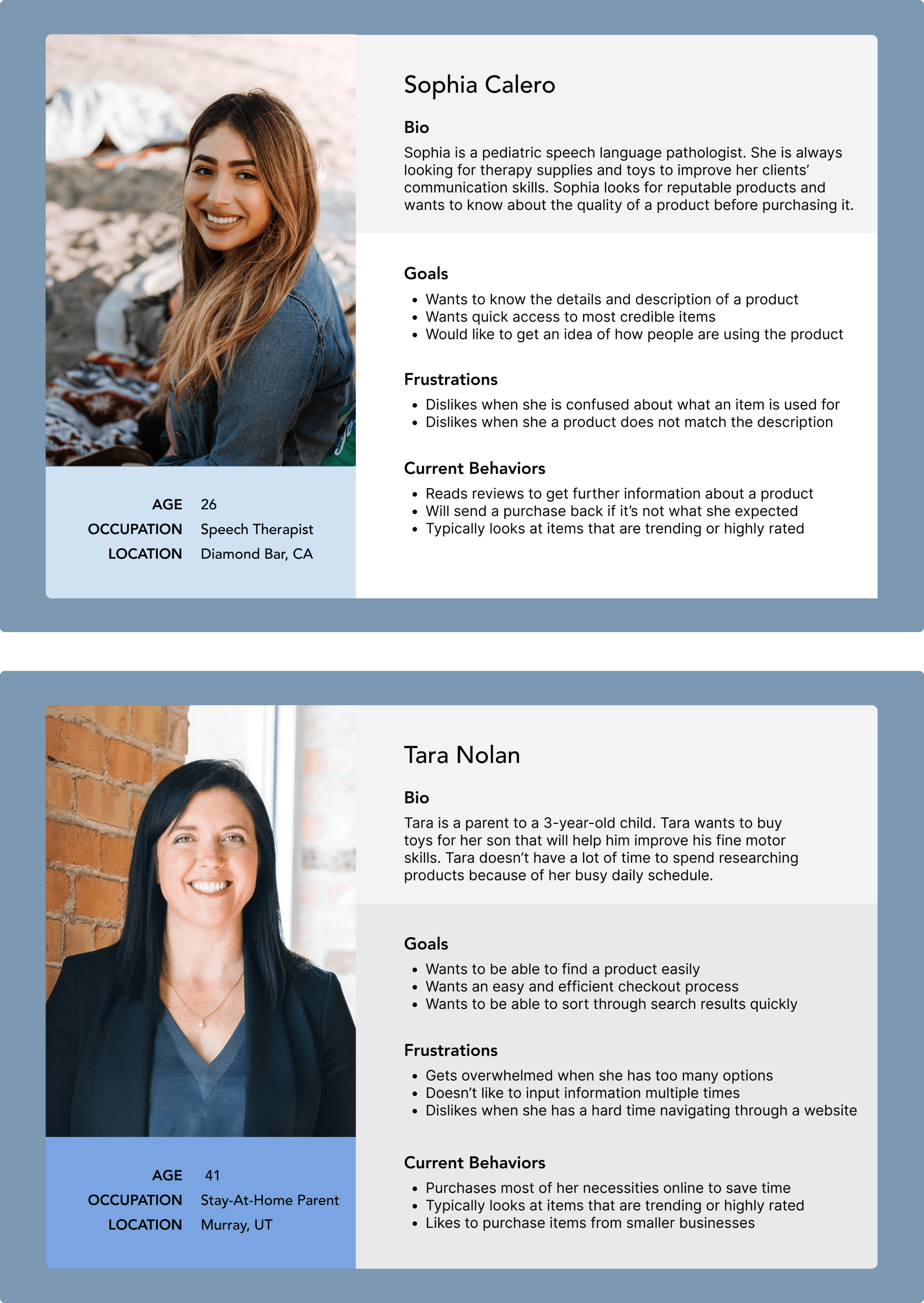
To understand who I was designing for, I spoke to six potential users that included a mix of teachers, occupational therapists, speech therapists, and a physical therapist, some of whom were also parents. I was able to gain insight into what was important to them when shopping for products for work or for their kids and what they enjoyed and found challenging about those experiences. After the interviews, I mapped out their responses to identify common patterns. Below are key findings from the interviews.
Personas
Identifying industry standards
Through a feature inventory, I analyzed the features of Therapro's website and those of its direct and indirect competitors. I was able to identify patterns and design opportunities that I applied to the redesign to create a more intuitive and familiar experience for users.

A closer look at the task
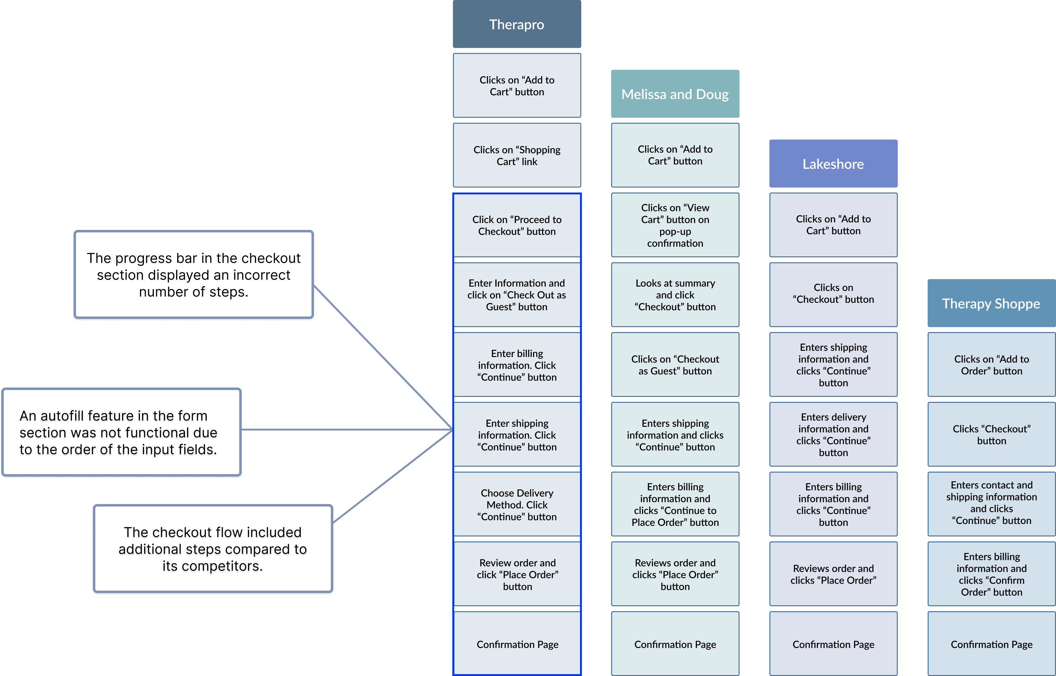
To identify and compare the steps within the product search and checkout flow for users on Therapro's and its competitors websites, I conducted a task analysis. I was able to gain a better understanding of the user journey and identify pain points with the product purchase flow.
Evaluating the architecture
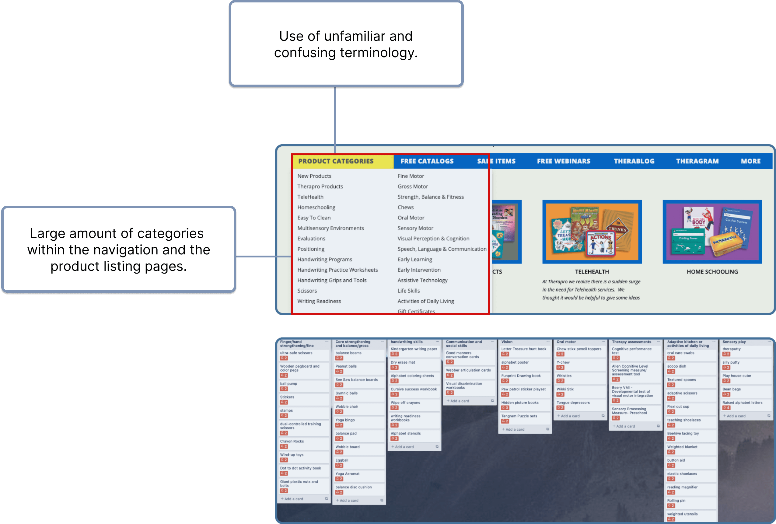
The navigation had a large number of categories nested under each section. I conducted a closed card sort with participants and through feedback, learned how people categorized items together and what they found confusing. I later redesigned the primary navigation based on the findings.
DEFINE
Defining the problem
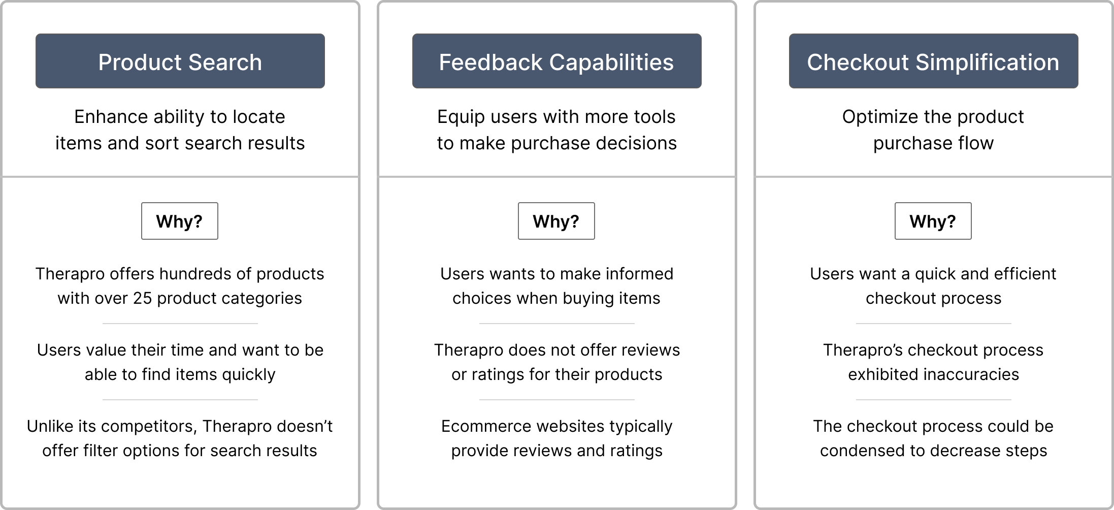
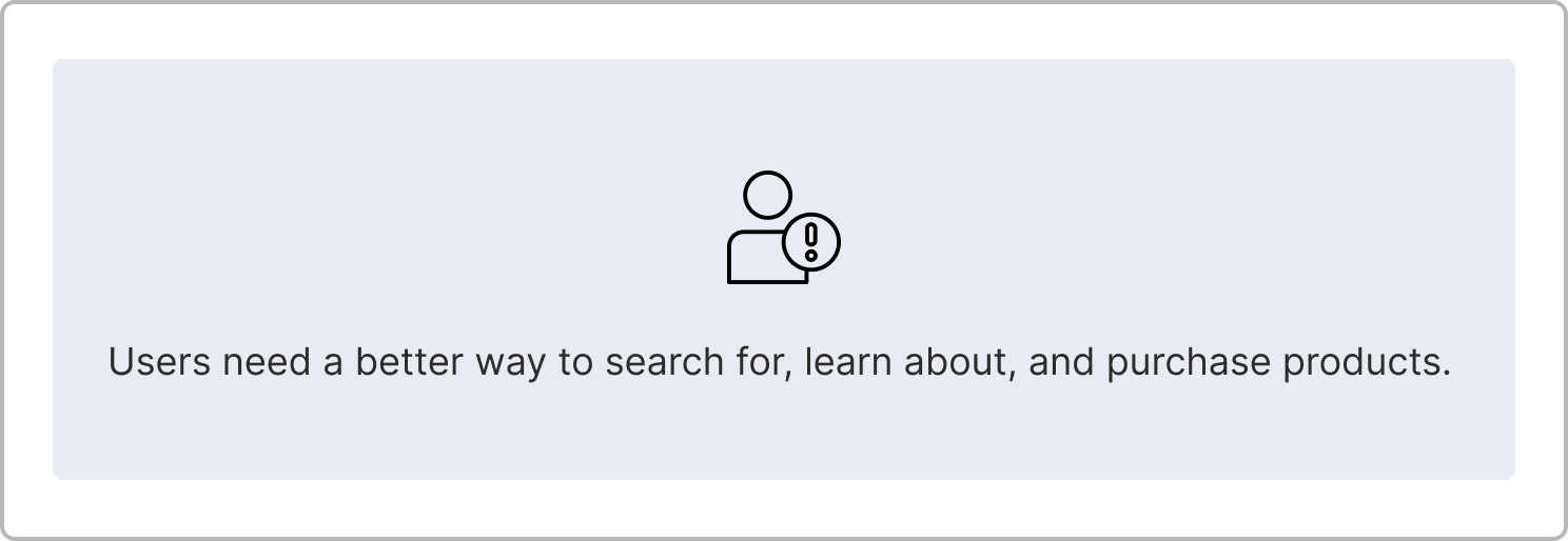
After gathering all the findings and uncovering insights related to user and business needs, I prioritized the redesign around three main areas.
IDEATE AND PROTOTYPE
Proposed solutions
Based on the research findings and through much ideation, I came up with these design solutions to address the three main areas mentioned above.

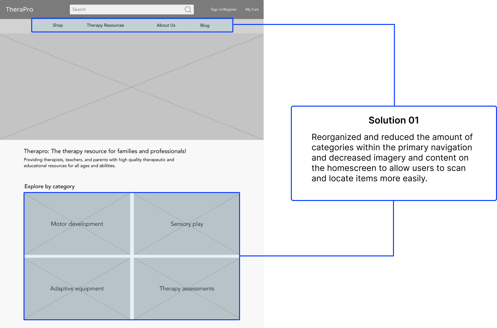
Improving the product search
After speaking with targeted users, we learned that time was precious to them whether it be due to their busy home lives or work schedules. They did not want to spend their time endlessly searching through product pages, listings, and search results when shopping.
Providing feedback capabilities
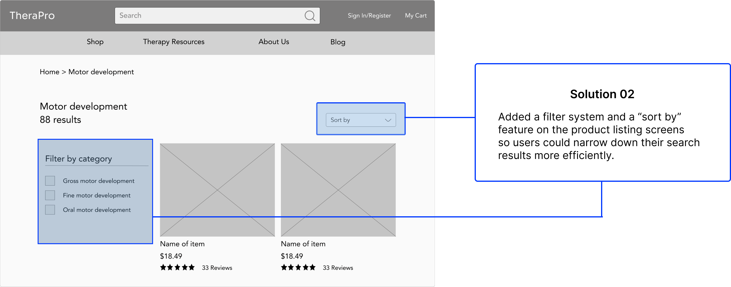
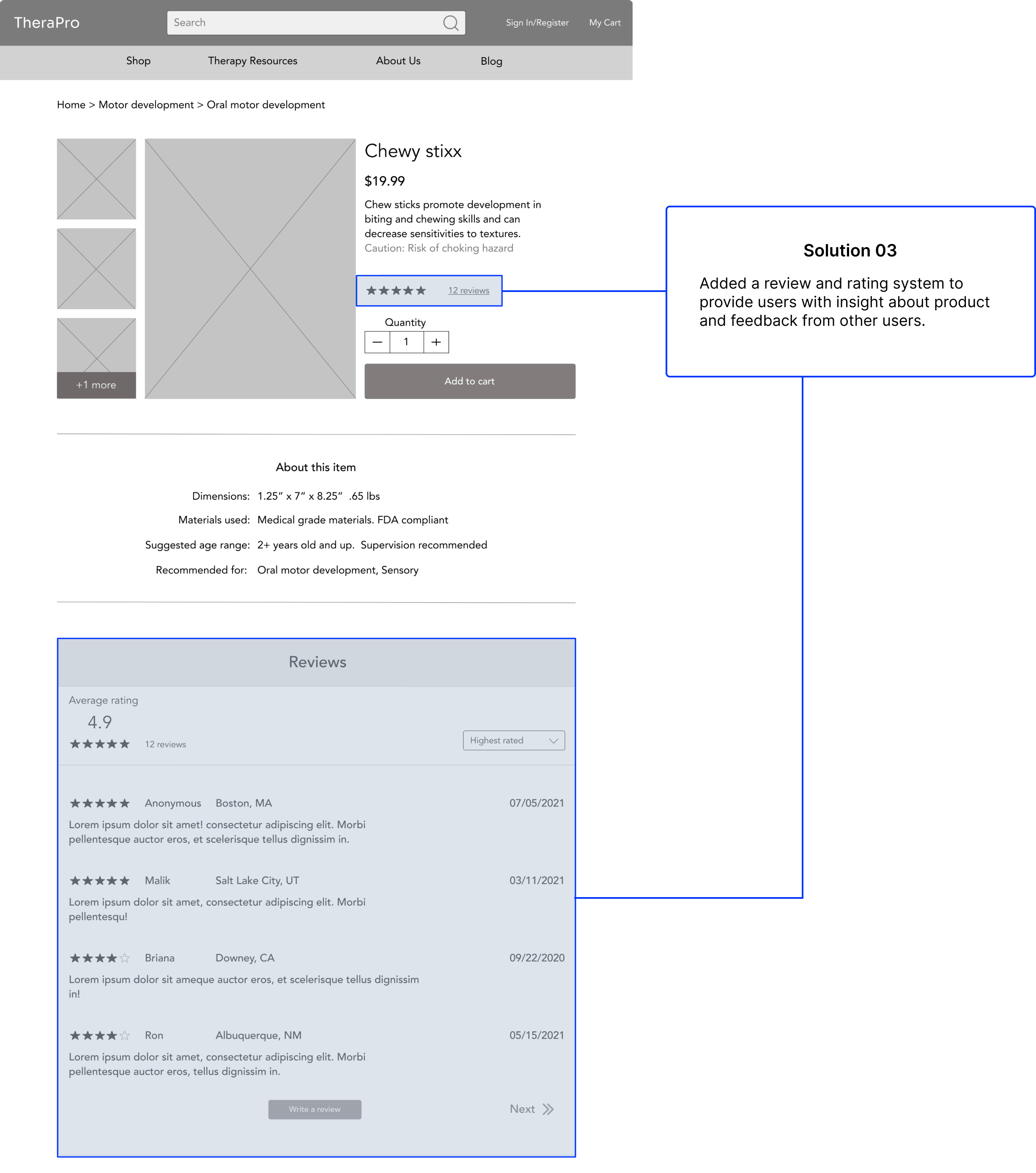
We also learned that people want to be ensured they are making good decisions when purchasing products. The people I spoke with during the interviews reported that they tend to read reviews from other customers to get a sense of what the product is like. Reviews and ratings are also typical features found in most e-commerce shopping experiences.
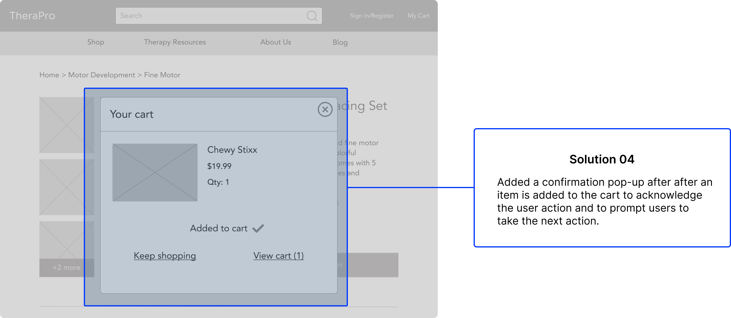
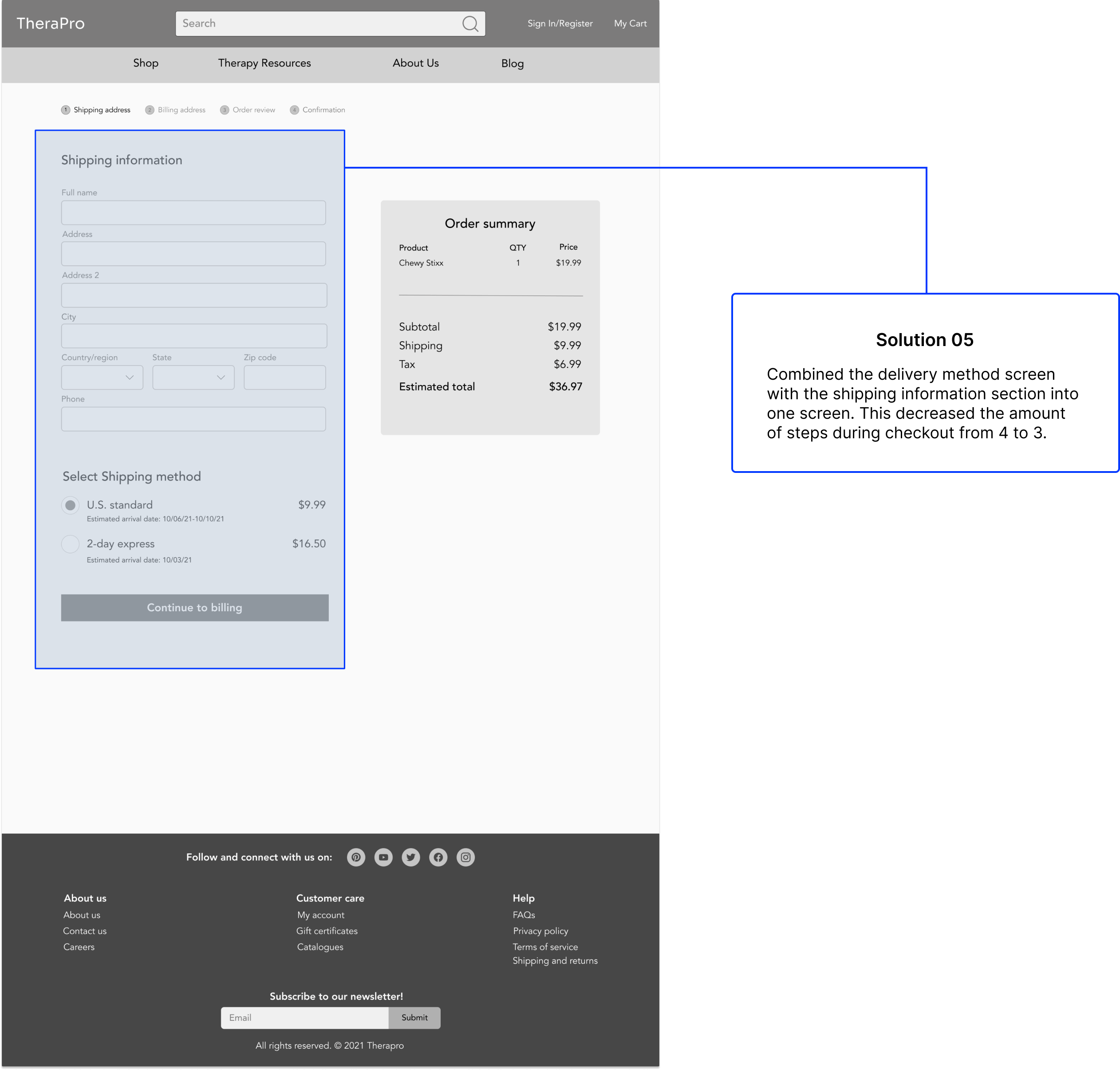
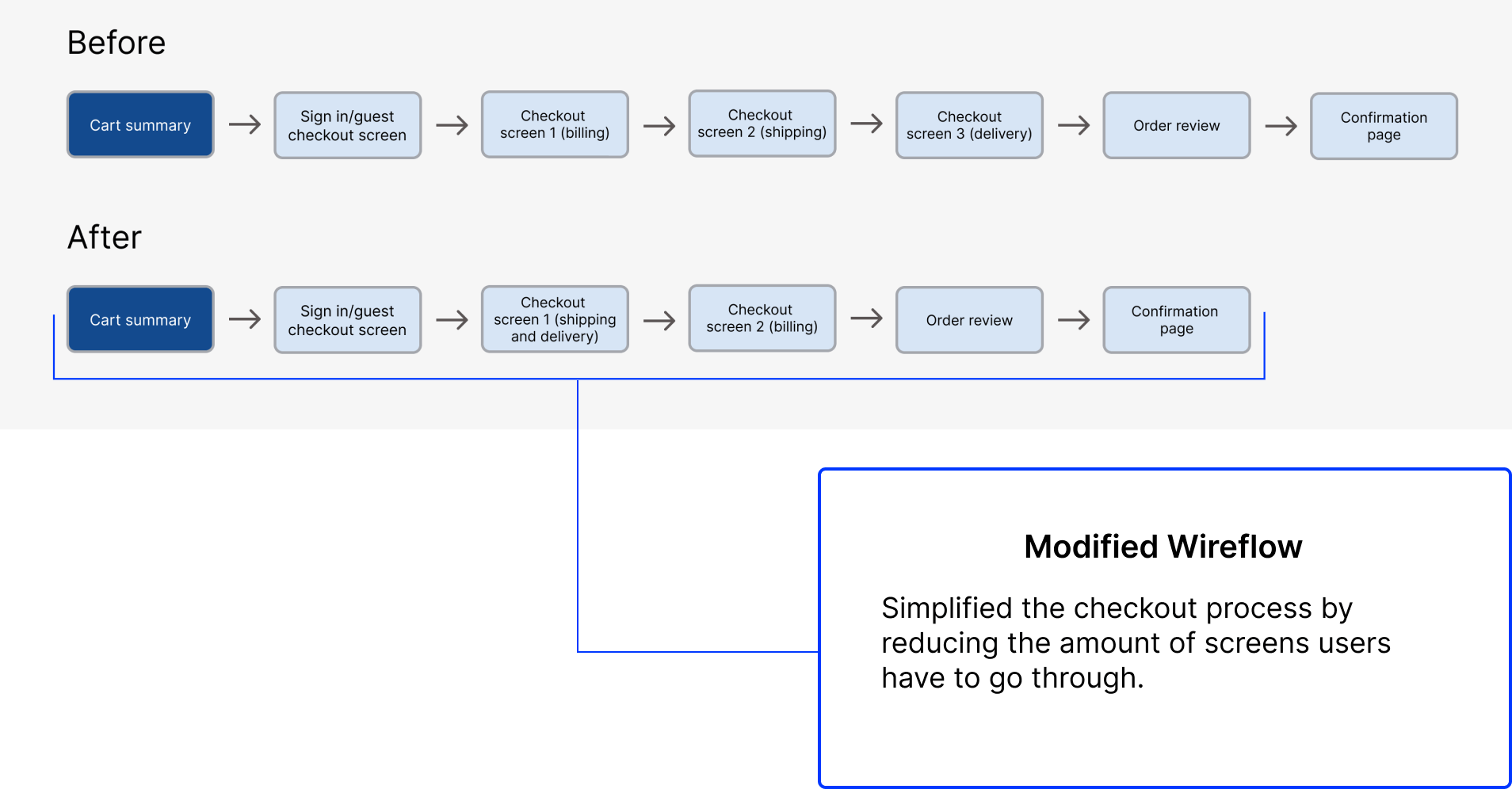
Optimizing the checkout process
We found that people expect a quick and efficient checkout process. Therapro's checkout process exhibited gaps in providing user feedback as well as more steps than its competitors.
TEST
Usability sessions
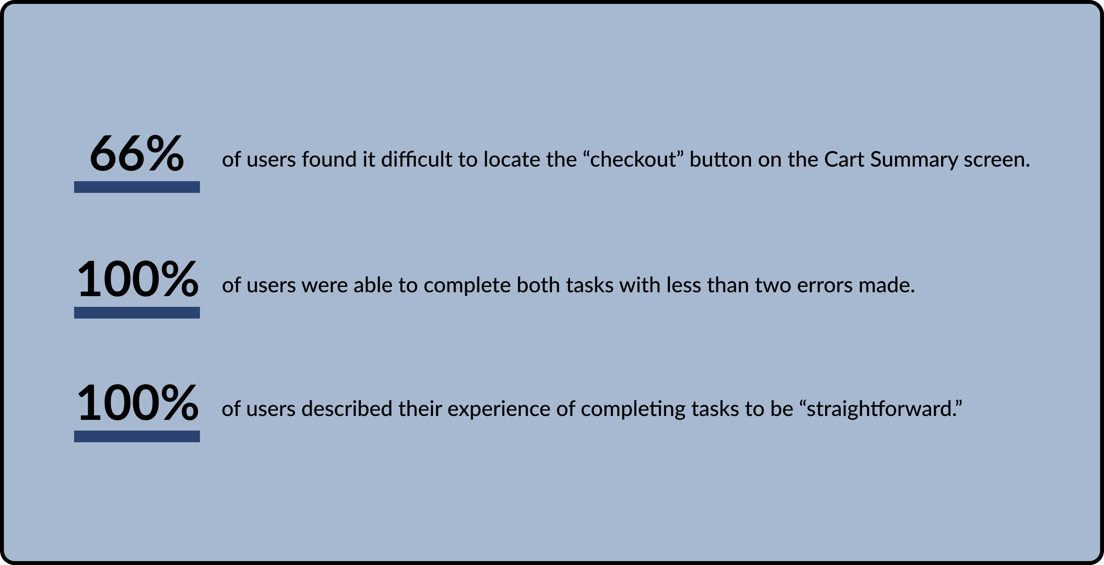
To validate and assess the design changes made, I conducted usability testing with participants over Zoom. Participants were asked to complete two tasks involving locating and purchasing items with mid-fidelity wireframes. The goal of the study was to observe users and gather insight into whether or not they could complete the checkout process with less than two errors. The most significant findings are listed below.
High-fidelity mockups
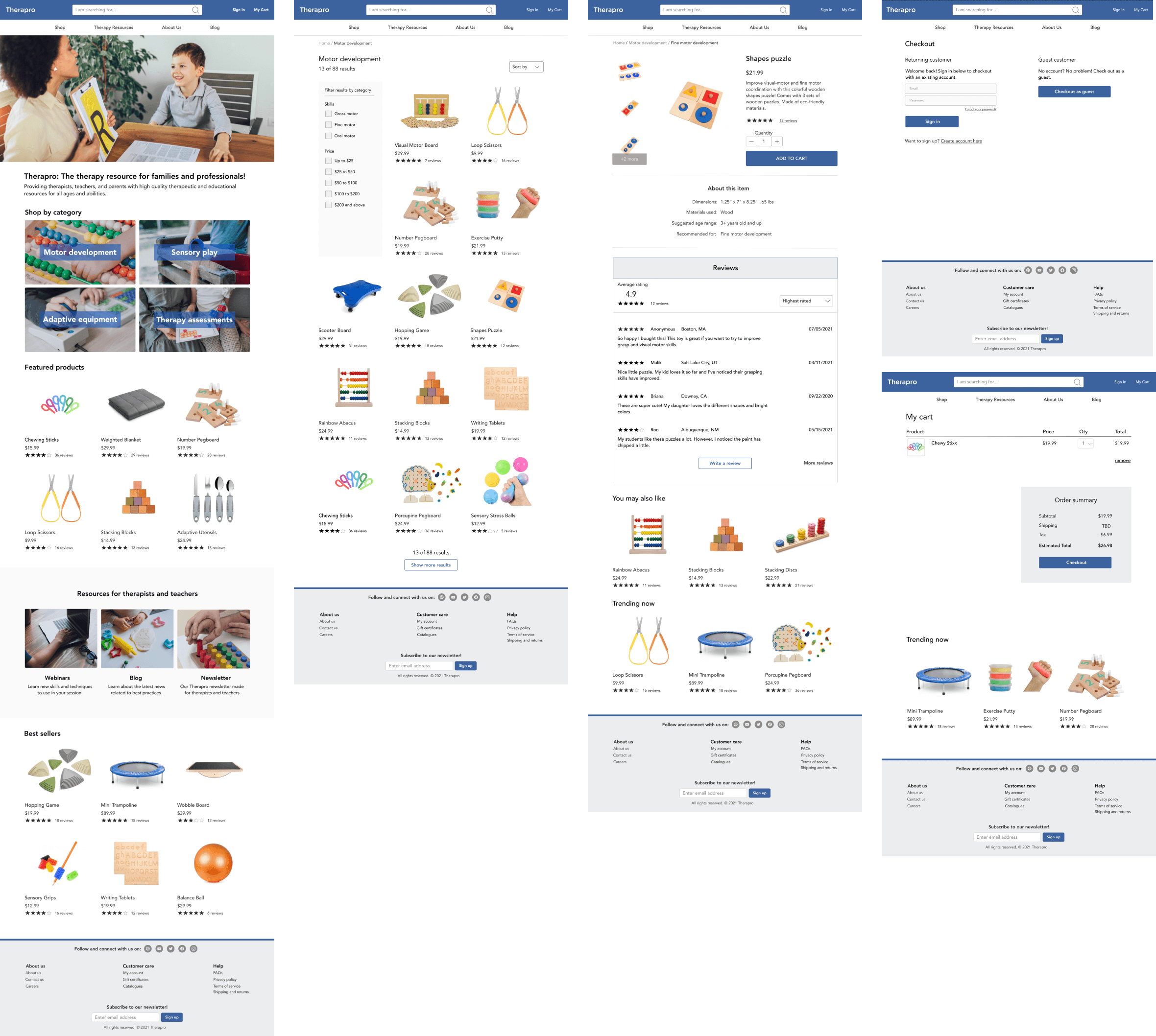
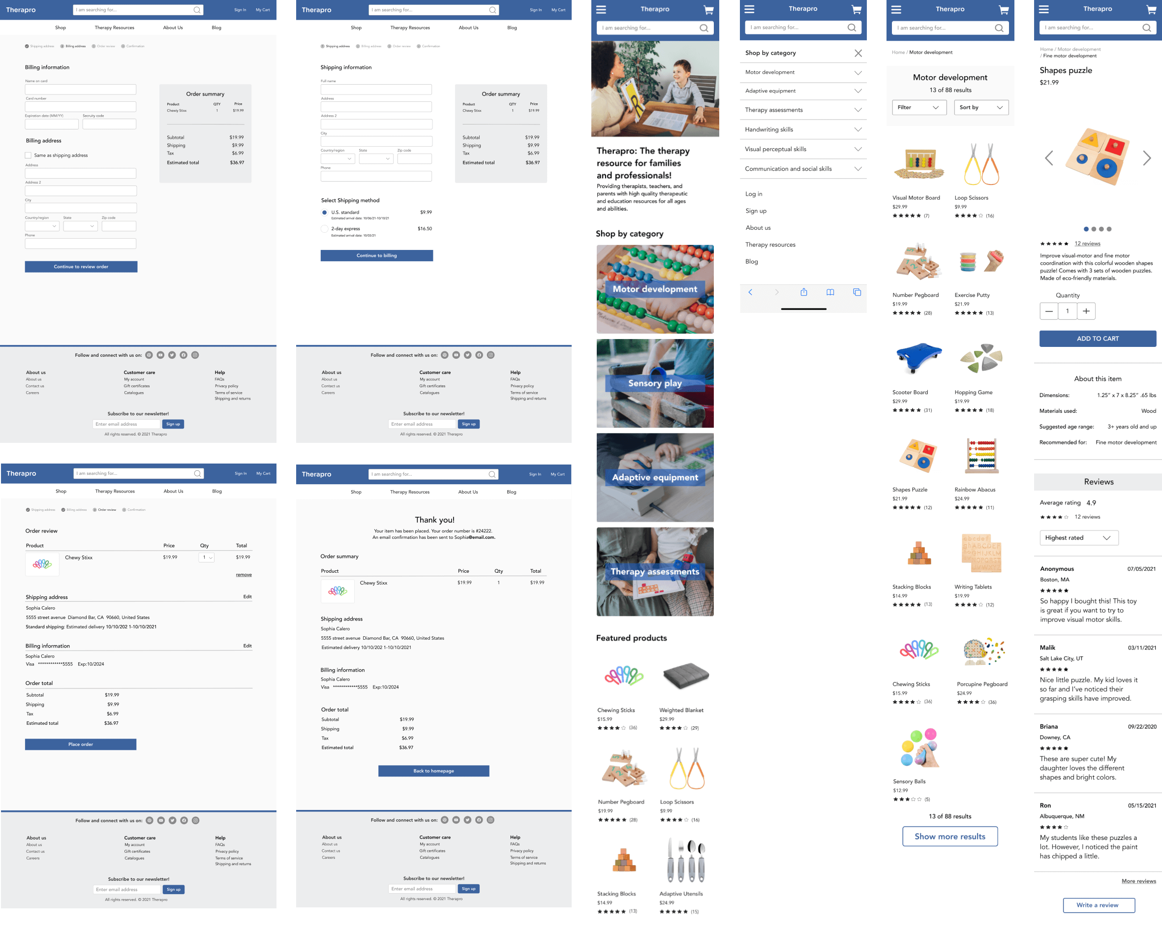
Moving forward, I designed high-fidelity wireframes and web-responsive mobile screens. Based on the feedback from the usability testing, I implemented changes to the new wireframes. Below are a few of the wireframes I created.
Lessons learned
Looking back, I would have liked to have incorporated usability testing of the website early in the research process to get feedback about the current user experience. It could have been useful in validating my redesign decision and providing further support for it, as well as possibly pointing out other areas for improvement.
This was my first project involving 1:1 interviews. Having talked with people and understanding their responses, I realized the importance of asking the right questions in order to better understand people's behavior and needs.
© 2023 Jessica Rodriguez. All rights reserved.